
Best Practices for Stakeholder Impact Reporting
Stakeholder impact reporting helps organizations measure and communicate how their actions affect various groups - like employees, customers, and communities. Unlike standard performance reports, it focuses on social, economic, and environmental outcomes, combining data and personal stories for a clearer picture.
Key Takeaways:
- Define Stakeholders: Use tools like Power/Interest Grids to identify and prioritize groups.
- Set Metrics: Focus on SMART goals and mix quantitative (e.g., percentages) with qualitative (e.g., testimonials) data.
- Collect Data: Combine surveys, interviews, and external sources for a balanced approach.
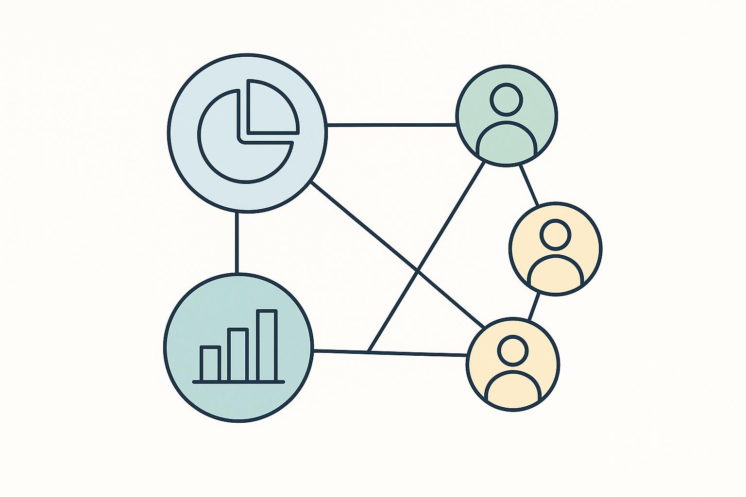
- Visualize Clearly: Use charts (e.g., bar, line) to simplify complex data.
- Communicate Transparently: Tailor messages for different audiences and share updates regularly.
- Continuous Improvement: Gather feedback to refine reports and align with evolving needs.
This approach builds trust, strengthens relationships, and ensures decisions align with stakeholder priorities.
Creating an effective and engaging impact report
Key Components of Effective Stakeholder Impact Reports
Crafting a stakeholder impact report that resonates requires focusing on three essential elements. When these components are thoughtfully addressed, they create a framework that not only informs but also engages stakeholders, helping organizations make better decisions and build stronger relationships.
Identifying and Understanding Stakeholders
The first step is to clearly map out who your stakeholders are and understand their influence, interests, and expectations.
Start with stakeholder mapping. This involves brainstorming to identify all groups and individuals connected to your organization - employees, customers, suppliers, regulators, community groups, and others. Once you have a list, categorize them using tools like the Power/Interest Grid. This model helps prioritize engagement:
- Stakeholders with high power and high interest need regular updates and active involvement.
- Those with high power but low interest should be consulted as needed.
- Groups with low power but high interest require consistent communication to maintain their support.
- Stakeholders with low power and low interest can be informed with minimal effort.
Another method, the Salience Model, evaluates stakeholders based on power, legitimacy, and urgency. For example, core stakeholders who possess all three attributes should be your top priority, while others like dominant or dangerous stakeholders require tailored approaches.
A practical example of these methods in action is the Vermont Department of Health. By identifying key stakeholders and focus areas, they created targeted scorecards that led to measurable improvements - such as a 22% increase in childhood immunizations and a 70% drop in youth smoking over 18 years [1].
Once stakeholders are mapped and categorized, the next step is to align your reporting goals with meaningful metrics.
Setting Objectives and Key Impact Indicators
Defining clear objectives and selecting the right metrics are critical for creating reports that provide actionable insights.
Start with SMART metrics - Specific, Measurable, Achievable, Relevant, and Time-bound. This approach ensures your data is focused and meaningful, not just a collection of numbers. For example, instead of simply counting training sessions offered (an output), measure how those sessions improved participants' skills or behaviors (an outcome).
Use a mix of quantitative and qualitative indicators. Quantitative data provides hard evidence, such as percentages or totals, while qualitative insights - like testimonials - bring the human element into focus. For instance, tracking an increase in program participation pairs well with personal stories from participants about how the program impacted their lives [2].
A great example of balancing these approaches is Sonoma County’s Human Services department. Their Upstream Investments initiative uses a shared measurement framework to track both poverty reduction data and qualitative insights into community well-being. This dual approach helps refine programs while demonstrating clear impact [3].
Another valuable metric is stakeholder engagement levels. Categorize stakeholders as Unaware, Resistant, Neutral, Supportive, or Leading to track their involvement and relationships over time [4].
Once your objectives and metrics are set, the next challenge is collecting and integrating diverse data sources effectively.
Data Collection and Integration
To support your objectives and metrics, you need a systematic approach to gathering and organizing data.
Primary data collection involves directly engaging stakeholders through surveys, interviews, focus groups, or observation. While this method ensures data relevance and quality, it can be resource-intensive. On the other hand, secondary data - from government reports, industry studies, or academic research - provides valuable context and benchmarking but may not always align perfectly with your specific needs.
The most effective strategy combines both. Use secondary data to frame your analysis, then supplement it with primary data to add depth and credibility.
Leveraging technology platforms can make this process smoother. For instance, SisterWeb, a nonprofit in San Francisco, uses tools like Clear Impact's Scorecard and Compyle to manage data and create public performance reports. Their system integrates hard metrics with softer elements like client testimonials and visuals, weaving together data and narrative in a compelling way [1].
When collecting qualitative data, ensure you capture stakeholder voices through quotes and stories. These add authenticity and emotional depth but require proper permissions to respect privacy.
Data integration is about creating a unified dataset from diverse sources. Standardize formats, set regular collection schedules, and implement quality controls to ensure accuracy. Regular validation - such as cross-referencing data and seeking stakeholder feedback - builds trust and strengthens the reliability of your reports.
Using Data Visualization in Stakeholder Reports
Once you've gathered and integrated your data, the next step is presenting it in a way that stakeholders can easily understand and act upon. Clear, well-designed visuals can transform dense datasets into compelling narratives, making it easier to drive decisions and foster engagement. Thoughtful visualization techniques serve as the bridge between raw data and actionable insights.
Effective Visualization Techniques
Choosing the right type of chart or graph is crucial. Each visualization method has its strengths, and matching the chart to your data’s story can mean the difference between clarity and confusion.
- Bar and column charts: Perfect for comparing quantities across categories.
- Line graphs: Ideal for showing trends over time, such as tracking progress or seasonal changes.
- Pie charts: Best used when there are fewer than five segments to compare proportions.
- Scatter plots: Useful for uncovering relationships between two variables.
- Heatmaps: Great for visualizing patterns across multiple dimensions, like program performance over time.
- Histograms: Excellent for showing data distributions, such as income levels, survey responses, or performance ratings.
When it comes to tools, platforms like Tableau, Microsoft Power BI, Google Charts, Looker, and Qlik offer robust options for creating professional visualizations [5]. Research even shows that well-designed visuals can lead to measurable outcomes, such as a 17% increase in conversion rates after incorporating specific design improvements [6].
"It doesn't matter how good the findings are if you aren't able to communicate them effectively with your team." - Nikki Anderson-Stanier, Founder, User Research Academy [6]
To ensure your visuals resonate with stakeholders, label charts clearly and avoid using technical jargon. Interactive elements like filters or clickable features can also enhance engagement, allowing stakeholders to explore the data themselves [5].
Breaking Down Data for Equity Insights
Data visualization can go beyond the basics when you disaggregate data for equity-focused insights. Breaking down data by demographics is essential to identifying disparities and ensuring fair representation among stakeholder groups.
Equity dashboards, for example, are a practical way to monitor fairness and inclusion within organizations or communities. These dashboards not only increase transparency but also help allocate resources more effectively. To make equity-focused visuals impactful:
- Keep visuals simple and clear to avoid overwhelming the audience [7].
- Use reliable data aligned with performance indicators to ensure accuracy [7].
- Provide context by comparing data to benchmarks or targets. For example, if 40% of participants in a program come from underrepresented groups, compare this to the 60% representation within the community.
Side-by-side comparisons, such as showing current demographics next to target figures, are especially effective at illustrating progress. Businesses that consistently track and report key metrics often see benefits like 12% higher revenue growth and 50% greater user satisfaction in their dashboards [9].
Interactive features like filters and sliders can also make equity dashboards more engaging, allowing users to explore data by demographic groups, time periods, or program areas without feeling overwhelmed [8].
Using Standardized Frameworks
Standardized frameworks ensure consistency in reporting, which builds trust and makes it easier for stakeholders to track progress over time. These frameworks also help maintain professional, comparable visualizations.
Tools like stakeholder analysis matrices are particularly useful for mapping out relationships and tailoring communication strategies. Common frameworks include:
- Mendelow’s Power-Interest Grid: Categorizes stakeholders by their power and interest levels.
- Influence/Impact Matrix: Focuses on the influence and impact of stakeholders.
- Salience Model: Considers power, legitimacy, and urgency simultaneously [10][11].
For example, in a supply chain project, a stakeholder analysis matrix revealed that mid-level managers held significant informal influence. Adjusting the engagement strategy resulted in 30% faster implementation times and an 85% satisfaction rate among stakeholders [10]. Similarly, in healthcare, this approach helped balance clinical and administrative needs, boosting process efficiency by 40% [10].
Whether you use Excel templates for simplicity or advanced tools like Stakeholder Circle® and Microsoft Power BI, the key is consistency. Regularly updating your stakeholder analysis ensures it reflects current dynamics and remains relevant [10].
Visualization frameworks should always lead to action. Highlight key findings in straightforward language and provide clear recommendations for addressing challenges [8][6].
"There is nothing, I repeat: nothing, more important than showing rather than telling." - Nikki Anderson-Stanier, Founder, User Research Academy [6]
sbb-itb-8feac72
Communicating Stakeholder Impact Findings
Sharing findings with stakeholders effectively requires more than just presenting data - it’s about connecting with each group in a way that resonates with their unique priorities and communication styles. Since different audiences have varying levels of technical knowledge and focus areas, a one-size-fits-all approach often falls short.
Tailoring Communication to Stakeholder Groups
To communicate effectively, you need to understand your audience. This means researching their backgrounds, concerns, and preferred communication formats [12]. Each stakeholder group has distinct needs:
- Executives: They prefer high-level dashboards that clearly link metrics to business outcomes.
- Community members: They need straightforward, jargon-free explanations in accessible formats.
- Partners and funders: They focus on detailed methodologies and accountability metrics.
A real-world example highlights this approach. A clinical trial aimed at African American women revamped its communication strategy by engaging directly with the community, simplifying language, and improving accessibility. These efforts paid off with a 78% increase in enrollment, enabling the team to meet recruitment goals 16 months early while retaining every participant [13].
Using inclusive language is equally important. It ensures that all stakeholders feel recognized and valued. For diverse communities, this might mean translating materials or adapting content to reflect cultural nuances [12].
Transparency is another essential element that builds trust and strengthens stakeholder relationships.
Building Transparency and Engagement
Clear communication isn’t just about sharing data - it’s about presenting it in a way that drives understanding and action. Tools like data visualizations and stakeholder mapping can help bridge the gap between raw information and meaningful insights.
Trust is the cornerstone of any stakeholder relationship, and transparency plays a critical role in earning it [14]. When organizations withhold information, it can damage their credibility and weaken long-term engagement. Being upfront about challenges is especially important. If something goes wrong, explain what happened, outline the steps being taken to address the issue, and share how you’ll prevent it from happening again.
For example, the Vermont Department of Health uses Clear Impact Scorecards to provide real-time updates on 22 health focus areas. These scorecards include measurable outcomes, detailed narratives, and actionable plans, making the data both accessible and useful for the community [1].
Transparency becomes even more vital during difficult times. One logistics company, for instance, faced global supply chain disruptions but managed to improve customer satisfaction by sharing regular updates, clear timelines for resolution, and detailed plans to ensure future reliability [14].
"Transparency is the foundation of trust. It shows stakeholders - whether they're employees, customers, or partners - that you have nothing to hide."
- Jeremy Capell, Chief Trust Officer [14]
Consistent follow-through is another way to earn trust. If you commit to quarterly updates or addressing specific concerns, deliver on those promises. Missed commitments can quickly erode trust [14].
"Trust is earned by saying what we will do, sharing why, and delivering what we said we would - transparently."
- Maria Castañón Moats, Paul DeNicola, and Matt DiGuiseppe, PricewaterhouseCoopers LLP [15]
Real-time updates also play a key role. By proactively sharing information, acknowledging challenges, and providing context for decisions, you can manage expectations and strengthen credibility [14]. Two-way communication, such as feedback sessions or interactive forums, further enhances engagement and ensures stakeholders feel heard [12].
Continuous Improvement in Stakeholder Impact Reporting
Delivering effective stakeholder impact reports is not a one-and-done task - it’s an ongoing process. Each report offers a chance to improve communication, strengthen trust, and refine strategies. Organizations that excel in this area treat every reporting cycle as an opportunity to learn, adapt, and align with the ever-changing needs of stakeholders and industry expectations.
Creating Feedback Loops
Organizations that stand out in stakeholder impact reporting actively seek and use feedback to improve. This input not only enhances individual reports but also builds stronger relationships with stakeholders.
Feedback can be collected in several ways, such as:
- Surveys that combine quantitative and qualitative questions
- One-on-one interviews to gain deeper insights
- Focus groups to foster open discussions
- Digital tools that integrate and analyze stakeholder input
When conducting interviews or focus groups, it’s helpful to clearly explain the purpose and potential benefits to encourage participation and improve the quality of responses [16].
But gathering feedback is just the first step - closing the loop is equally important. Organizations need to show stakeholders how their input has shaped changes in reporting or even broader organizational decisions. This transparency not only builds trust but also motivates stakeholders to stay engaged in future feedback efforts [16].
By creating structured feedback systems, companies can refine current reports while setting the stage for future improvements.
Applying Lessons Learned
Keeping up with industry standards and regulatory requirements is crucial for creating relevant and compliant stakeholder impact reports. Companies can align their efforts by using well-established frameworks like IFRS and TCFD, while also embracing emerging best practices. Cross-functional teams are particularly effective in navigating these complex frameworks, focusing on metrics that align with corporate goals while maintaining consistency in reporting formats [17].
Some leading organizations are already integrating lessons learned into their reporting strategies. For example, in May 2025, IKEA tracked its carbon emissions as part of its 2030 carbon-positive goal, while Microsoft linked executive bonuses to meeting sustainability targets [18].
Technology also plays a big role in improving reporting processes. Tools powered by AI and natural language processing can streamline data collection, processing, and analysis. Nonprofits using advanced analytics tools have been shown to be up to 40% more effective in presenting their results [19]. By regularly updating practices through materiality assessments and staying aligned with evolving ESG requirements, organizations can ensure their reports remain relevant and impactful [17][18][19].
Developing Leadership Skills for Better Reporting
Beyond refining processes, strong leadership is key to turning complex data into clear, actionable insights. Effective stakeholder reports require leaders who can blend technical expertise with excellent communication.
To measure the success of stakeholder reports, organizations need clear performance indicators and tracking systems. For example, nearly half of government relations professionals spend six to 10 hours a week engaging stakeholders, underscoring the importance of evaluating the return on this effort [20]. Strong leaders use tools like engagement matrices to classify stakeholders and track progress over time.
"Focusing on outcomes rather than deliverables can create space for exploring multiple alternatives. This can lead to finding solutions more strongly aligned with outcomes." - Stephen Townsend, Graduate Teaching Associate, Columbia University [20]
Leadership in this area also requires cross-functional expertise. Leaders must be adept at using technology for gathering and analyzing data while maintaining a human touch in their interactions. Tools like live dashboards and dynamic reporting systems can transform static reports into ongoing conversations, fostering trust and engagement [19][20].
For technical professionals stepping into leadership roles, developing strong communication and stakeholder management skills is especially important. Bridging the gap between complex technical data and accessible insights is a critical skill set. Programs like those offered by Tech Leaders (https://technical-leaders.com) can help professionals enhance both their technical and non-technical leadership capabilities, ensuring they’re well-equipped to handle the demands of stakeholder impact reporting.
Conclusion
Stakeholder impact reporting plays a crucial role in fostering trust, showcasing accountability, and driving meaningful progress. As Nina Tschinkel, Vice President at Catalyst Opportunity Funds, puts it:
"Impact reporting demonstrates a commitment to a firm's mission and goals through transparency, and it allows stakeholders to hold the group accountable" [21].
Think of it as the nonfinancial counterpart to financial reporting - providing stakeholders with the clarity they need to make well-informed decisions [21].
While quantitative data provides measurable results, weaving in qualitative stories adds a human touch, enhancing credibility and fostering stronger connections. Yet, there’s room for growth: 61% of verified investors have solid impact strategies, but only 35% actively seek stakeholder feedback [22]. This gap highlights the importance of building feedback systems that encourage authentic collaboration.
Organizations that excel in this area not only deliver measurable, mission-driven outcomes but also craft engaging narratives that tie data to larger objectives [1]. By adopting clear measurement frameworks, setting benchmarks, and establishing feedback loops, impact reporting evolves into a dynamic tool for ongoing improvement [21]. These practices empower leaders to inspire and implement meaningful change.
For technical professionals stepping into leadership roles, mastering communication and stakeholder management is key. Tech Leaders offers specialized programs designed to help bridge the gap between technical expertise and strategic leadership, ensuring data-driven insights lead to actionable outcomes.
FAQs
What’s the best way to combine quantitative and qualitative data in stakeholder impact reports?
To create impactful stakeholder reports, it's important to blend quantitative data (like metrics and measurable results) with qualitative insights (such as personal stories and testimonials). While numbers provide solid proof of impact, the stories bring depth and a personal touch. Together, they create a more complete view of your organization's influence.
To strike this balance, incorporate visual tools like charts and graphs to present numerical data clearly. Pair these with quotes or short case studies that highlight individual experiences. This combination not only makes your report more engaging but also ensures that both the hard facts and the human side of your work are well-represented. This dual approach helps you connect with stakeholders on both logical and emotional levels.
What are the best practices for creating transparent and trustworthy stakeholder impact reports?
Creating transparent and trustworthy stakeholder impact reports begins with involving stakeholders directly in the process. Their input helps ensure the data is both accurate and relevant to their interests. By doing this, you can clearly communicate measurable outcomes that highlight your organization's accountability and the impact of its efforts.
When presenting this information, clarity is key. Use data visualization techniques like charts, graphs, or infographics to simplify complex data, making it easier for everyone to understand. Additionally, prioritize high-quality, reliable data and provide meaningful insights into your strategies and their results. Taking these steps not only builds trust but also encourages engagement and strengthens your relationships with stakeholders.
How can technology and visualization tools improve stakeholder impact reporting?
Technology and visualization tools are game-changers when it comes to making stakeholder impact reporting more effective. They take complex data and turn it into clear, easy-to-digest visuals, like charts, dashboards, and stakeholder maps. These visuals help communicate insights in a way that’s straightforward, ensuring stakeholders grasp the key points without getting lost in the details.
On top of that, platforms designed for stakeholder analysis and collaboration improve transparency and encourage stronger engagement. With these tools, organizations can craft data-driven stories that are not only easier to understand but also resonate with a wide range of audiences.