
How to Use Dashboards with Risk Reporting Templates
Dashboards and risk reporting templates are powerful tools for managing organizational risks. Dashboards provide a real-time view of critical metrics, while templates standardize how risks are documented and assessed. When integrated, they turn raw data into actionable insights, helping teams prioritize risks, allocate resources, and improve accountability.
Key benefits of combining these tools include:
- Real-time visibility: Dashboards highlight emerging risks and trends.
- Efficiency: Automating data flow from templates reduces manual errors.
- Accountability: Clear roles and progress tracking improve mitigation efforts.
- Compliance: Standardized reporting simplifies audits and regulatory adherence.
To get started:
- Choose or customize risk reporting templates that align with your organization's needs.
- Connect templates to dashboards using tools like Excel, Google Sheets, or APIs.
- Automate updates for accuracy and format data for U.S. standards (e.g., MM/DD/YYYY, $1,000,000).
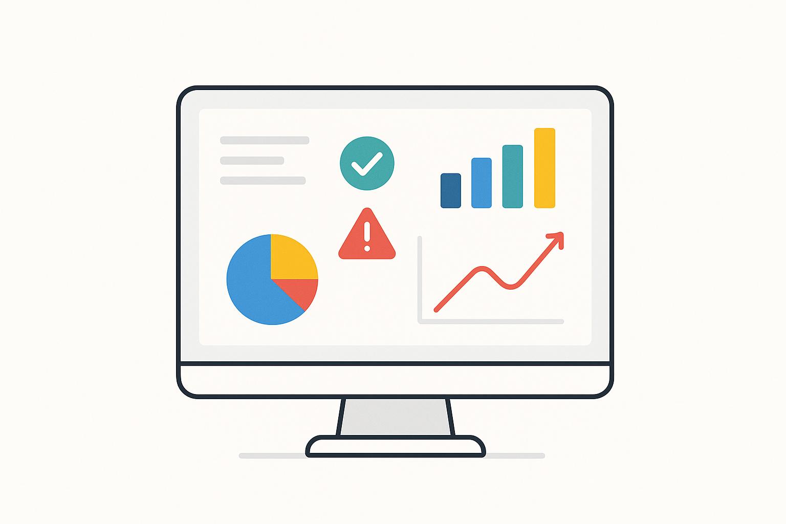
- Use visualizations like heat maps and bar charts to communicate risks effectively.
- Tailor dashboards for different stakeholders, ensuring clear and relevant insights.
Creating Risk Dashboards and Metrics | Exclusive Lesson
Choosing and Customizing Risk Reporting Templates
Picking the right risk reporting template is not a one-size-fits-all task. The template you decide on becomes the backbone of how your organization identifies, tracks, and communicates risks. Choosing wisely ensures your risk communication is effective and actionable.
Key Features of Good Risk Reporting Templates
The best risk reporting templates have a few key traits that make them practical and easy to use. These features help ensure your team captures the right information without unnecessary complexity.
A good template should align with your organization's risk framework. This means incorporating clear risk categories, consistent assessment scales, and standardized terminology. Without this alignment, your team risks falling into confusion or inconsistency, which can weaken your overall risk management efforts.
A standardized structure is also essential. A clear and consistent format makes it easier to understand risk information, compare data across departments, and identify patterns that support organization-wide decisions.
Using precise language is another must. Ambiguity can lead to misinterpretation, so it's important to define terms and concepts consistently. This ensures everyone is on the same page when discussing risks.
Below are the core elements every strong risk reporting template should include:
| Element | Description | Purpose |
|---|---|---|
| Risk ID | Unique identifier for each risk | Enables tracking and cross-referencing |
| Risk Description | Clear explanation of the risk | Provides context and understanding |
| Risk Category | Classification (e.g., financial, operational) | Helps with organization and prioritization |
| Likelihood | Probability of the risk occurring | Supports risk assessment and ranking |
| Impact | Potential consequences if the risk happens | Guides resource allocation |
| Risk Score | Combines likelihood and impact | Allows quick comparison and prioritization |
| Mitigation Status | Current state of response efforts | Tracks progress and accountability |
| Risk Owner | Person responsible for managing the risk | Ensures clear accountability |
Keep your focus on critical attributes while allowing additional details to be included in supporting documents. This approach ensures reports remain clear and concise without sacrificing important context.
To enhance clarity, consider adding data visualization tools like charts, graphs, or risk heat maps. These can make it easier for stakeholders to quickly identify high-priority risks and grasp the overall risk landscape.
Once you have a solid standard template, the next step is tailoring it to suit your organization's specific needs and challenges.
Customizing Templates for Specific Use Cases
After establishing the basics, it's time to refine your template to address the unique aspects of your industry, projects, and organizational goals. This involves categorizing risks, using tailored assessment scales, and designing mitigation strategies that work for your specific situation.
For instance, risk categories should reflect your industry's challenges. A tech company might prioritize cybersecurity and data privacy, while a manufacturing firm might focus on supply chain and operational risks.
Assessment scales should also match your organization's size and risk appetite. A startup might prefer a simple three-point scale (low, medium, high), while a larger corporation may require a more detailed five- or seven-point scale with clearly defined thresholds for impact and likelihood.
Customization should also consider the audience. Senior executives may prefer high-level summaries, while risk practitioners might need more detailed, technical reports. Adapting the level of detail and presentation style ensures your message resonates with the right stakeholders.
To ensure a comprehensive view of risks, use a mix of methods like brainstorming, interviews, surveys, scenario analysis, or historical data reviews. Combining qualitative and quantitative approaches ensures your template addresses a wide spectrum of risk factors.
Include actionable details like timelines, responsibilities, and expected outcomes. A good template doesn’t just identify risks - it also serves as a guide for responding to them effectively.
Finally, think about the layout and design. Elements like headings, colors, fonts, and symbols should match the complexity and purpose of your reports. For example, a template for monthly board updates might require a polished, formal design, while one for daily operational tracking could be more straightforward. A flexible template can adapt to different reporting needs without requiring a complete overhaul.
Connecting Dashboards with Risk Reporting Templates
Linking customized risk templates to dashboards provides real-time risk insights that enable quicker, more informed decision-making. By establishing seamless data flow, automating updates, and formatting data specifically for US-based teams, this integration transforms risk reporting into a dynamic, continuously updated tool. Here’s how to set up these connections efficiently using modern integration methods.
Setting Up the Connection Between Templates and Dashboards
The first step is to identify your data sources and choose the right integration method. Most organizations store risk reporting templates in tools like Excel, Google Sheets, or dedicated risk management platforms. Each requires a slightly different approach to connect with dashboards.
For spreadsheet-based templates, there are several options:
- Direct file imports: Upload data files manually or on a schedule.
- API connections: Automate data transfer between systems.
- Automated data pipelines: Continuously sync data without manual intervention.
For example, Microsoft Power BI offers built-in Excel integration with automatic refreshes, while Tableau can connect directly to Excel files and track changes in real time. Similarly, Google Sheets provides API functionality, making it easy to link with dashboard platforms like Looker Studio with minimal effort.
"A real-time dashboard is an essential tool for any team that relies on up-to-the-minute data to make fast, confident decisions." - Emily Lucek, Technical Content Creator [2]
If you’re using specialized risk management software, integration often involves API connections or database queries. Many enterprise platforms already include pre-built connectors for popular dashboard tools, simplifying the process. Select a method that aligns with your team’s technical expertise and the required update frequency. For instance, file-based connections are ideal for periodic updates, while API-driven integrations work best for near real-time data refreshes.
Finally, ensure that fields in the templates - like risk IDs, categories, likelihood scores, and impact assessments - align perfectly with dashboard widgets. This eliminates the need for manual adjustments and ensures a smooth data flow.
Automating Updates and Keeping Data Accurate
Automation is key to maintaining accurate, up-to-date dashboards while reducing manual work. Real-time dashboards thrive on streaming data pipelines that process information continuously and reflect changes almost instantly [2]. Automated workflows can track updates to risk assessments, mitigation statuses, or other critical fields in your templates.
Some effective automation techniques include:
- Change Data Capture (CDC): Monitors database-stored templates for changes and updates dashboards accordingly.
- Event streams: Processes data updates in real time.
- Webhooks: Ideal for cloud-based systems, triggering updates when new risks are added or ownership changes.
Once automated, the focus shifts to ensuring data accuracy. Your pipeline should standardize inconsistent field formats, aggregate data into meaningful time periods, and apply business logic to ensure reliable insights [2]. Storing streaming data efficiently enables faster queries and visualizations, keeping dashboards both accurate and easy to use [2].
Strong data governance practices are essential for building trust in automated risk reporting [3]. Use certified data sources, document the entire process (from data collection to dashboard visualization), and regularly monitor pipelines for performance issues like failed updates or delays [2]. Alerts for errors or refresh problems can help you address issues quickly.
Formatting for US-Based Teams
To improve usability and reduce confusion, format dashboards according to US standards. This includes:
- Date formats: Use MM/DD/YYYY.
- Currency displays: Format as $1,000,000.
- Number formatting: Follow the 1,000.00 pattern.
- Time format: Use the 12-hour clock with AM/PM.
Additionally, align with common US business practices. Use familiar terms like "fiscal year" and standard quarter designations (e.g., January–March, April–June). For measurements, apply Fahrenheit for temperatures and imperial units where applicable.
These adjustments make dashboards more intuitive for US-based users, improving engagement by eliminating the need for mental conversions or guesswork. A well-formatted dashboard ensures stakeholders can focus on insights rather than deciphering the data's presentation.
Viewing and Monitoring Risks in Real Time
Building on the foundation of integrated dashboards, real-time visualizations and alerts take your risk management to the next level. Once your dashboards are connected and automated, the focus shifts to designing clear visual elements and setting up precise alerts. The goal? To spotlight critical risks while maintaining a balance between detail and simplicity, ensuring swift and effective responses. This approach transforms real-time insights into actionable strategies for managing risks.
Best Practices for Dashboard Visualizations
When it comes to risk visualization, choosing the right chart type is key. For instance:
- Heat maps: Perfect for prioritizing risks across categories, offering an immediate visual cue for areas requiring attention.
- Bar charts: Great for comparing risk levels across different groups, providing a clear sense of magnitude.
- Line graphs: Ideal for tracking trends over time, helping users anticipate changes and identify emerging risks.
- Scatter plots: Useful for uncovering correlations between various risk factors.
Creating a clear visual hierarchy is just as important. Use bright colors strategically - red for critical risks, yellow for moderate concerns, and green for acceptable levels. Consistency in color schemes and fonts enhances readability, while limiting visual elements ensures the most critical information is front and center. Effective design helps users quickly grasp the story your data tells [1][4].
Setting Up Alerts and Scheduled Reports
Automated alerts are crucial for proactive risk management. The process starts with defining Key Risk Indicators (KRIs) that are measurable, relevant, and actionable [8]. Establish clear thresholds, often using a tiered system (Green, Yellow, Red zones), to trigger alerts when specific conditions are met.
"Alert quality management (AQM) helps you optimize your alert strategy to create fewer, more valuable alerts that pinpoint incidents and minimize alert fatigue."
– Neil MacGowan, Director of Solutions Architects at New Relic [7]
For maximum effectiveness, configure alerts across multiple channels - email, SMS, push notifications, or Slack. Include critical details like risk thresholds, severity levels, and recommended actions. Timing also plays a role; for example, you can suppress unnecessary notifications during off-hours or scheduled maintenance. A manufacturing company, for instance, might set an alert for equipment downtime that activates when a machine is idle for over 30 minutes, sending an email to the maintenance team with a link to the machine's service history [8].
To prevent alert fatigue, focus on notifications that have a real business impact. Filter alerts based on user roles, suppress duplicates, and refine alert rules based on ongoing feedback [8]. Testing your alerts regularly ensures the system remains reliable [6]. Assign severity levels to match the urgency of the situation - critical alerts might warrant immediate phone calls, while moderate risks could be summarized in daily emails [5].
Comparison of Visualization Tools
Each visualization type serves a specific purpose in risk monitoring. Here's a breakdown of common options:
| Visualization Type | Best Use Case | Strengths | Limitations |
|---|---|---|---|
| Heat Maps | Prioritizing risks across categories | Quick visual cues; aids pattern recognition | Can oversimplify complex relationships |
| Bar Charts | Comparing risk levels across groups | Easy to interpret; clear magnitude comparisons | Static view; doesn’t show trends |
| Line Graphs | Tracking trends over time | Displays patterns and trajectories; highlights emerging risks | May become cluttered with too many data series |
| Scatter Plots | Analyzing relationships between factors | Identifies correlations and outliers | Requires some statistical knowledge |
| Pie Charts | Showing proportions of risk distribution | Simple percentage breakdowns | Best used sparingly for limited categories |
Your choice of visualization should match your audience. For instance, board members often prefer high-level summaries like heat maps and trend charts. Risk management teams, on the other hand, might benefit from scatter plots or multi-series line graphs for deeper analysis. Combining multiple visualization types on a single dashboard can provide both broad overviews and detailed insights. Adding interactive features, such as filters for date ranges, risk categories, or business units, along with drill-down options, empowers users to explore data and uncover actionable insights with ease.
sbb-itb-8feac72
Communicating Effectively with Stakeholders
Turning complex risk data into actionable insights is key to effective stakeholder communication. Different stakeholders prioritize different aspects - CFOs might zero in on financial risks, while project managers focus on potential delays. To address these diverse needs, it’s essential to craft dashboards and reports that speak directly to each audience, all while maintaining the accuracy of the data. At Tech Leaders, we specialize in bridging the gap between technical data and strategic decision-making, emphasizing the importance of clear risk communication as a cornerstone of leadership.
The first step in successful risk communication is understanding your audience. Knowing their background, interests, and expertise allows you to design visualizations that truly resonate and deliver the insights they need.
Customizing Views for Different Stakeholders
Tailoring dashboards and reports to suit different roles ensures that each stakeholder gets the information they care about most. For example:
- Executives need high-level overviews. Dashboards for them should highlight key performance indicators (KPIs) and trend summaries, such as overall risk exposure and aggregated risk scores. Simple, clear visuals make it easy for them to absorb the big picture quickly.
- Department managers benefit from more operational details. Their dashboards should include insights into risk trends, actionable steps, and updates on mitigation efforts.
- Risk management teams require comprehensive data. They need detailed risk registers, tools for correlation analysis, and interactive features to dive deeper into specific risks when necessary [9].
This isn’t just about showing different data points. It’s about translating technical jargon into plain language that everyone can relate to. Instead of using terms like "probability distributions", describe risks in terms of their potential to cause budget overruns or project delays. This approach makes the data relevant and understandable, even for those without a technical background. By integrating these tailored views into unified dashboards, every decision-maker gets the precise information they need to act swiftly.
Automating Report Delivery
Consistency is just as important as customization. Automating how reports are delivered ensures that stakeholders receive updates on time, every time. Scheduled or trigger-based automation reduces the chance of manual errors and keeps everyone informed. Regularly reviewing the frequency of these reports and incorporating feedback helps fine-tune the process and maintain accuracy [10].
Conclusion
By combining dashboards with risk reporting templates, organizations can revolutionize how they track and respond to potential threats. This integration simplifies complex risk data, transforming it into clear, actionable insights that guide better decision-making across all levels of the business.
The advantages go well beyond basic data visualization. When dashboards are connected to live data from risk templates, real-time monitoring becomes a reality. This allows teams to identify emerging risks early, preventing them from escalating into larger issues - a necessity in today’s fast-paced business environment.
This integration also sharpens decision-making. With seamless data flow, teams can confidently assess risk probabilities and impacts, enabling precise resource allocation and strategic planning. Guesswork is replaced with reliable, data-driven insights.
Beyond the technical benefits, this approach enhances communication across all levels of the organization. Risk data, no matter how complex, becomes accessible to everyone - from executives needing high-level summaries to risk teams requiring detailed analyses.
Key Points Recap
- Customizing Templates: Tailor risk reporting templates to fit your specific needs. By doing so, your dashboards will display data that is both relevant and actionable.
- Reliable Automation: Ensure strong, automated connections between templates and dashboards. This includes setting up dependable data flows, automating updates for accuracy, and formatting for U.S. standards like date formats, currency symbols, and measurement units.
- Effective Visualization: Design dashboards with clarity and interactivity in mind. Features like drill-down capabilities, intelligent alerts for critical risks, and scheduled reports keep teams informed without overwhelming them.
- Stakeholder-Focused Views: Customize dashboards for different roles. Executives may need summary overviews, while managers require detailed operational insights. Automated report delivery ensures consistency and minimizes manual errors.
With only 38% of businesses reporting a formal risk management strategy in place [11], integrating dashboards with risk reporting templates offers a clear competitive edge. Organizations that adopt this system can respond to threats more quickly, allocate resources more effectively, and ensure compliance with regulations. At the same time, they foster the transparency and accountability that today’s stakeholders expect, positioning themselves for long-term success.
FAQs
How can I make sure my risk reporting templates align with my organization's risk management framework?
To make your risk reporting templates work seamlessly with your organization's risk management framework, start by customizing them to mirror the framework’s key components - like identifying risks, assessing their impact, planning mitigation strategies, and ongoing monitoring. The goal is to strike a balance between being clear and detailed while integrating helpful data visualizations to make insights easier to grasp.
Don't forget to regularly review and tweak these templates to reflect shifts in your organization's risk priorities or updates to the framework itself. Keeping them up to date ensures they're always relevant and useful for timely monitoring and decision-making.
What are the best practices for seamlessly integrating risk reporting templates with dashboards to ensure accurate and reliable data?
To seamlessly connect risk reporting templates with dashboards, start by focusing on automating data validation. This means implementing tools or scripts that can instantly detect errors or unusual patterns in your data. Real-time alerts for data inconsistencies can save you from costly mistakes down the line.
Another key step is leveraging dedicated risk management tools. These tools are designed to constantly evaluate data quality, ensuring your reports stay accurate and up-to-date. Pair this with regular health checks and validation routines to prevent faulty data from skewing your dashboard insights.
By combining automation with consistent data checks, you’ll establish a dependable system for real-time risk tracking, empowering you to make well-informed decisions.
How can I customize dashboard visualizations to effectively present risk data to different stakeholders?
How to Present Risk Data Effectively Through Dashboards
When designing dashboards to showcase risk data, it's crucial to align visualizations with the audience's needs and expertise. For executives, stick to high-level visuals like heat maps or risk matrices. These tools make it easy to pinpoint critical issues at a glance. On the other hand, technical teams benefit from detailed charts and trend analysis, which allow for a more granular examination of the data.
Adding interactive features can make dashboards even more effective. Let users dive deeper into specific data points for greater insights. Be sure to use colors, thresholds, and labels that align with your organization's risk standards. This ensures the visuals remain clear, consistent, and easy to interpret. By tailoring dashboards for different audiences, you can improve comprehension and help drive smarter decisions across the board.