
How to Measure Change Impact with Dashboards
Dashboards simplify tracking organizational change by turning complex data into clear, actionable insights. They help measure progress, identify risks, and connect technical metrics to business outcomes. Here's how dashboards can support your change initiatives:
-
Key Metrics to Track:
- Achievement Metrics: ROI, cost savings, and business outcomes.
- Completion Metrics: Milestones like training completion or task percentages.
- Acceptability Metrics: Adoption rates, engagement, and satisfaction.
-
Tailored Dashboards for Stakeholders:
- Executives: Focus on ROI, financial impact, and strategic risks.
- Directors: Track team performance, adoption rates, and operational efficiency.
- Team Leads: Monitor individual behavior changes, training progress, and day-to-day performance.
-
Effective Design Tips:
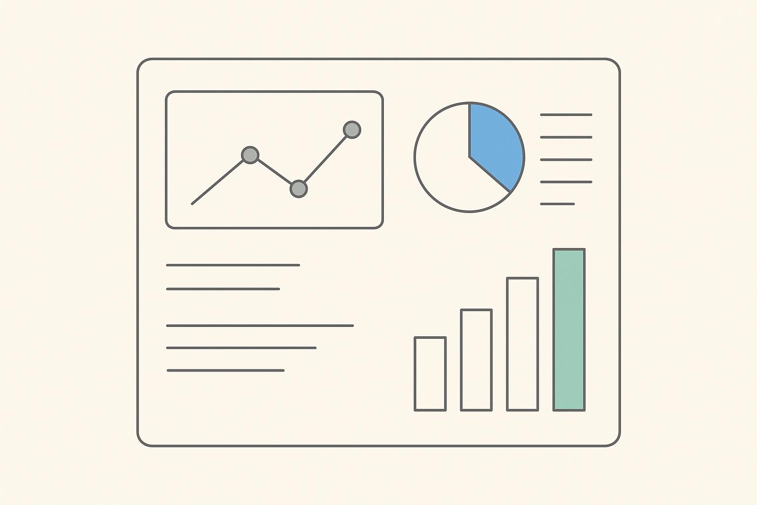
- Use clear visuals like charts, trend lines, and traffic-light indicators.
- Organize dashboards into top-level KPIs, leading indicators, and diagnostic details.
- Ensure consistency in data definitions and visual formats.
-
Tools to Build Dashboards:
- Power BI: Ideal for Microsoft ecosystems.
- Tableau: Offers interactive visuals for deep analysis.
- Looker Studio: Integrates well with Google platforms.
Dashboards bridge the gap between data and decision-making, offering real-time insights to keep change initiatives on track. By focusing on measurable outcomes and tailoring dashboards for different roles, leaders can ensure alignment and drive meaningful results.
Change Management Dashboard
Setting Clear Change Outcomes and Questions
Before creating a dashboard, it's essential to define what success looks like. Vague goals often lead to dashboards that might look impressive but fail to drive meaningful results. Dashboards need clear, measurable targets that everyone can easily track and interpret.
A well-defined change outcome includes four key elements: a specific target, a unit of measure, a baseline, and a time frame. These elements should directly connect to a business objective, whether it's tied to revenue, cost, risk, or customer satisfaction. This approach turns abstract aspirations into actionable goals that dashboards can track automatically.
Converting Change Goals into Measurable Outcomes
Take a goal like "improve deployment process" and make it specific: "reduce deployment lead time from 10 to 7 days (a 30% improvement) within two quarters, while maintaining defect rates." This version provides a clear target and a deadline.
It's also important to pair improvement goals with a control metric. For example, reducing deployment time is meaningless if defect rates increase. Similarly, a goal like "increase user adoption" could be refined to: "achieve 80% weekly active users among eligible employees within 90 days of launch." For employee engagement, a measurable target might be: "raise engagement survey scores related to change from 3.4 to 4.0 out of 5 over two survey cycles." These outcomes include a starting point, a target, and a timeframe, making it easy to monitor progress on a dashboard and quickly identify any setbacks.
Understanding the difference between leading indicators and lagging indicators is also crucial. Leading indicators, such as training completion rates or early feature adoption, provide early signals about whether your efforts are on track. Lagging indicators, like defect reduction or customer satisfaction scores, show the actual impact of the change. Dashboards should prioritize leading indicators for early adjustments, while pairing them with lagging indicators to connect efforts (like training participation) to outcomes (like improved performance).
For qualitative feedback, such as responses from surveys or town halls, coding themes and assigning numeric sentiment scores can help visualize trends effectively.
Identifying Questions for Each Leadership Level
Different leadership levels require different types of data. Tailoring dashboards to address their specific questions ensures everyone gets the insights they need.
Executives are focused on big-picture outcomes, such as financial impact and strategic risks. They might ask: "Are we achieving the expected financial benefits in dollars?" "Is this initiative reducing key risks?" or "Where are the bottlenecks in our portfolio of changes?" Dashboards for executives should highlight metrics like projected versus realized cost and benefit in dollars, risk heatmaps by business unit, and portfolio-level KPIs, including adoption rates, incident volumes, and employee satisfaction.
Directors and senior leaders are more concerned with operational efficiency and team performance. Their questions might include: "Which teams are lagging in adoption or training?" "How is this change impacting throughput or error rates?" and "Are there signs of resistance or burnout?" Dashboards at this level should show metrics like change lead times by team, defect rates post-implementation, local engagement scores, and capacity indicators (e.g., the number of concurrent changes per team). This helps them identify areas that need support or rebalancing.
Team leads and frontline managers need detailed, day-to-day data to manage individual performance and behavior changes. Their questions might include: "Who hasn’t adopted the new process yet?" "How is performance trending after the workflow change?" and "Who needs more coaching or training?" Dashboards for this level should include individual or squad-level usage metrics, training completion rates, operational KPIs like resolution times, and flags for low engagement or adoption.
To ensure alignment across all levels, start with a shared change narrative, an outcomes map, and a metric dictionary that defines each KPI - its unit, calculation, and ownership. This ensures everyone interprets the data consistently. Dashboards can then be "layered" versions of the same core metrics: executives see high-level summaries, directors get domain-specific breakdowns, and team leads focus on task-level details - all derived from the same data source.
Reliable outcomes require combining data from various systems. Operational data - like deployment logs, ticketing systems, and CRM analytics - should merge with people data from HR platforms, learning systems, and surveys. Each outcome must connect to specific metrics, such as timestamps for lead times, unique user IDs for adoption, or standardized survey scores for engagement. This integration allows dashboards to update automatically, reducing manual work and ensuring the information stays current.
Technical managers play a critical role in translating system-level improvements into business outcomes. Programs like Tech Leaders can help engineers refine their ability to turn process metrics into strategic KPIs.
With clearly defined outcomes and well-identified questions for each leadership level, you're ready to build dashboards that deliver the right insights to the right audience. The next step is selecting precise metrics to quantify these outcomes.
Selecting and Defining Metrics
Once you've outlined your desired outcomes and key leadership questions, it's time to zero in on specific metrics for your dashboards. The goal is to choose KPIs that directly reflect the impact of your change initiative - not general business metrics that would shift regardless of your efforts.
For each potential metric, tie it back to a specific change outcome. For instance, if you're introducing a new project management tool, focus on metrics like user logins and feature adoption rather than overall company revenue. The most effective metrics are:
- Directly tied to the change initiative
- Based on reliable data sources
- Responsive to adjustments or pilot efforts
- Aligned with U.S. leadership priorities, such as cost per employee, revenue impact, or customer satisfaction scores
Each metric should come with a precise definition. This includes what it measures, how it’s calculated, the unit of measure, the target or benchmark, and who owns the data. For example, an "adoption rate" might be defined as: "The percentage of target employees who logged into the new system at least once in the last 30 days, calculated weekly, with a target of 85% by 06/30/2026, owned by the IT operations team." This level of detail ensures everyone is on the same page when interpreting dashboard data and avoids confusion during discussions.
Main Metric Categories for Change Management
Change-related metrics typically fall into four key categories, offering a well-rounded view of your initiative’s progress. Structuring your dashboard around these categories makes it easier for leaders to spot issues and for teams to track improvements in adoption, value realization, and risk management.
Adoption and Usage Metrics
These metrics measure whether people are actually engaging with the new tool, process, or behavior. For a U.S.-based SaaS rollout, you might track:
- Percentage of target employees who logged in over the past 7 or 30 days
- Feature utilization rates (e.g., how many are using key functions like approvals or reporting)
- Time-to-first-meaningful-use after account creation
Segment this data by business unit, region, or time zone, and display trends over time using U.S. date formats (e.g., 03/31/2026). Establish thresholds, such as "less than 60% weekly active users" or "under 30% usage of a critical feature", to trigger alerts and prompt immediate action.
In 2023, a large financial services firm used a centralized dashboard to track the adoption of a new CRM system. Metrics like "% of sales reps using the CRM daily", "average time to complete key tasks", and "employee satisfaction with the tool" helped guide their efforts. Over six months, adoption climbed from 45% to 88%, and task completion times dropped by 30%, thanks to targeted training and communication efforts [1][3].
Business Outcome Metrics
These metrics showcase the financial and operational results of your change. Examples include:
- Incremental revenue directly tied to the change
- Cost savings per quarter
- Changes in cost per transaction
- Return on investment (ROI) expressed in standard U.S. formats (e.g., $1,250,000.50)
Operational metrics might include cycle times (e.g., hours to approve a request), error rates per 1,000 transactions, or first-contact resolution percentages. Dashboards should highlight improvements, like reducing approval time from 72 hours to 36 hours, and show both absolute values and percentage changes. This helps leaders quickly assess whether the change is delivering enough value to justify its cost and risks.
Employee Sentiment Metrics
These metrics translate employee feedback into measurable trends. Use standardized survey questions to gauge confidence in the change, communication clarity, or perceived workload impact, then map responses to numerical scales (e.g., 1–5 or 1–7). Track:
- Average sentiment scores
- Distribution of responses (e.g., percentage selecting 4 or 5)
- Trends over time by team or location
Pair sentiment data with participation rates (e.g., survey response rates above 70%) to ensure reliability. Low participation rates can signal resistance or disengagement, which may require separate attention.
A 2024 case study highlights a healthcare organization that monitored a major EHR rollout using a change dashboard. Key metrics included "% of clinicians completing required training", "% of patient records entered in the new system", and "number of critical incidents post-go-live." By tracking these in real time, the organization reduced post-implementation incidents by 40% within three months and improved clinician satisfaction scores from 2.8 to 4.1 on a 5-point scale [2][3].
Risk and Health Indicators
These metrics provide early warning signs to prevent small issues from escalating into major problems. Examples include:
- Number of open change-related issues
- Average time to resolve issues
- Number of critical incidents
- Training completion gaps
- Signals of resistance (e.g., negative sentiment spikes or low adoption in specific teams)
Use traffic-light indicators and trend arrows to show not just the current status but also whether things are improving or worsening. For instance, a rising number of incidents week over week might signal the need for immediate intervention. Adding brief annotations to the dashboard can provide context for spikes, such as a recent policy change or system update.
Tagging each metric to one of these four categories simplifies navigation and ensures you’re capturing both leading indicators (early signs like training completion rates) and lagging indicators (final outcomes like productivity gains). Together, these metrics offer a comprehensive view of your change initiative’s progress.
Turning Qualitative Feedback into Quantitative Data
Qualitative feedback, like survey comments or focus group insights, can be challenging to visualize on a dashboard. The solution? Convert it into numeric values for easier tracking and analysis.
Start by identifying recurring themes in the feedback, such as "training quality", "tool usability", or "workload concerns." Then, assign scores based on frequency (how often a theme appears) and sentiment (positive, neutral, or negative). For example, if 30 out of 100 survey responses mention training as a problem, you’d assign a 30% frequency score with negative sentiment for the "training quality" theme. Adding metadata like role, location, or business unit allows you to pinpoint problem areas more effectively.
Likert-scale survey questions (e.g., 1–5 scales) are particularly useful for generating numeric data. These scores can be displayed as averages, percentage breakdowns, or trends over time. Keep scales consistent across surveys to simplify aggregation and trending, and ensure higher scores always indicate a positive outcome (e.g., clarity, confidence, or support).
Set alert thresholds for these metrics to trigger action when necessary. For example, an average confidence score below 3.5 or more than 25% of respondents selecting 1 or 2 on workload impact could prompt follow-up interviews or targeted communications. Align these thresholds with key milestones - like go-live dates or fiscal quarter ends - to ensure timely interventions.
Real-world examples highlight how these techniques can drive mid-course corrections. For instance, a U.S. company rolling out a new CRM noticed low adoption among sales reps in certain regions. Dashboard data revealed low training completion rates and poor sentiment around "ease of use." Targeted coaching sessions addressed these issues, boosting active users and increasing closed deals. In another case, a process automation project reduced cycle times but led to employee dissatisfaction due to workload imbalances. Segmenting sentiment metrics helped leadership rebalance responsibilities and improve communication, stabilizing employee sentiment and reducing incidents.
Developing the ability to select and define effective change metrics requires practice. Programs like those offered by Tech Leaders (https://technical-leaders.com) can help professionals - such as engineering managers and product leaders - learn how to connect technical data with business KPIs and employee metrics. These courses cover skills like designing measurable change hypotheses, identifying leading and lagging indicators, and effectively communicating dashboard insights to non-technical stakeholders. By investing in these skills, organizations can reduce reliance on external consultants and create reusable frameworks for future initiatives.
Creating Dashboards for Different Roles
Designing dashboards tailored to specific roles starts with a unified data model. This model standardizes key entities - like initiatives, teams, applications, and user groups - and metrics such as adoption rate, readiness score, and deployment frequency. From this single source of truth, dashboards can provide role-specific insights: executives get organization-wide summaries, change leaders see department or role-based comparisons, and teams access detailed breakdowns by service or squad. Below are examples of how dashboards can be customized for executives, change leaders, and engineering teams [1,2,5].
Building Dashboards for Executives, Leaders, and Teams
Role-specific dashboards align with the strategic goals and metrics outlined earlier, offering actionable insights for each audience.
Executive dashboards should focus on outcomes and remain concise. Highlight 5–8 high-level KPIs that answer, "Are our change initiatives achieving their goals?" Key metrics include change success rate, business impact and ROI (in U.S. dollars), employee engagement, stakeholder satisfaction, and speed of adoption. Use simple visuals like scorecards, trend lines, and traffic-light indicators to quickly show progress. Drill-downs by business unit, region, or product line allow deeper analysis without cluttering the main view [3,7,5].
For instance, an executive dashboard might show strong adoption rates and a positive ROI, with high employee engagement scores. However, a flagged issue with stakeholder satisfaction could prompt further investigation into specific regions or departments, ensuring that potential problems are addressed early [1,4].
Change leader dashboards require more operational insights. These dashboards track metrics like training completion rates, assessment scores, communication effectiveness (e.g., open rates and attendance), readiness indices by department, and resistance indicators such as negative sentiment or increased incident volumes. Organize these metrics into three sections: readiness and risk scorecards at the top, leading indicators (training, communication, sentiment) in the middle, and diagnostic tables or drill-throughs at the bottom [1,3,5].
For example, a change leader might notice that while overall training completion is high, certain regions lag behind, paired with lower sentiment scores and rising incident reports. This combination suggests targeted coaching and additional support are needed to prevent minor issues from escalating [1,3].
Engineering team dashboards focus on delivery and quality metrics that connect software changes to user outcomes. Key performance indicators include deployment frequency, lead time for changes, change failure rate, mean time to recovery (MTTR), incident volume, defect escape rate, and cycle time. Additional metrics might include feature adoption and user satisfaction scores for new releases. Visuals like time series charts for deployment and incident trends, control charts for lead time, and breakdowns by service or squad provide engineers with actionable insights [3,7,6].
For example, an engineering dashboard might show an increase in deployment frequency after implementing a new CI/CD tool, but also a temporary spike in failure rates. A drill-down could reveal that failures are concentrated in a specific service lacking adequate automated testing, prompting the team to prioritize test improvements. This level of detail helps engineers refine their processes in real time [3,6].
By using the same data model, you can create dashboards that serve different audiences while maintaining consistency. For instance, an adoption metric defined as the percentage of employees logging into a system within 30 days might appear as a single number on an executive dashboard, as a segmented bar chart by department for change leaders, and as a time series by squad for engineers. This unified approach ensures clarity and alignment across all dashboard views [1,2].
Organizing Visuals for Easy Understanding
Effective dashboards rely on clear, intuitive visuals to communicate insights quickly. A proven layout strategy divides dashboards into three vertical zones: top-level KPIs, leading indicators, and diagnostic details. This structure allows users to scan key data at a glance and dive deeper when necessary [1,3,4].
The top zone highlights overall performance and key alerts. For executives, this might include KPI cards showing metrics like adoption rate, ROI, employee engagement, and stakeholder satisfaction, each with a color-coded indicator (green, yellow, or red) and trend arrows. For change leaders, this zone might feature readiness scores, training completion rates, and risk flags. Keeping this section compact ensures users can absorb critical information in seconds [1,3,4].
The middle zone focuses on leading indicators that explain top-level results. Executives might see adoption trends over recent months alongside bar charts comparing performance across business units. Change leaders could review segmented views of training completion by role or sentiment scores by location, while engineering teams might analyze time series charts for deployment frequency and lead time trends. Consistent formatting - such as chart types, time ranges, and U.S. number and date formats (e.g., 1,250.50; MM/DD/YYYY; and $ for currency) - helps reduce cognitive effort [2,3].
The bottom zone provides diagnostic details like tables, segmented charts, and drill-throughs. For example, if the top zone flags a drop in training completion, the bottom section might display a table showing each department's completion percentage and pending employee count. Clicking on a specific department could reveal even more granular data. This layered design minimizes clutter while offering deeper insights when needed [1,3].
Filters and drill-downs further enhance usability. Filters for time (using MM/DD/YYYY), business unit, role, and location (e.g., U.S. states or regions) let users focus on relevant data. Drill-downs, such as clicking an "at risk" initiative to uncover affected teams or training gaps, help users move from high-level signals to root-cause analysis quickly [2,3].
For users in the U.S. accessing dashboards on laptops, tablets, or phones, responsive layouts are crucial. Features like large tap targets, clear color contrast, and plain-language labels ensure dashboards load efficiently and display properly across devices [3,4].
Well-structured dashboards can drive informed decisions. For example, a change leader dashboard might reveal that one department has low adoption and proficiency indicators, paired with rising incident rates. A segmented view pinpoints the issue, while diagnostics uncover root causes like low training completion and negative sentiment. This insight enables targeted interventions to improve both adoption and operational performance [3,4].
Similarly, executives might spot overlapping initiatives straining certain U.S. regions or teams. A top-level view could show declining employee engagement and rising incidents, while a deeper dive reveals that multiple initiatives are scheduled simultaneously in the same area. This allows leaders to adjust schedules and workloads to stabilize productivity and reduce resistance [1,4].
Crafting effective dashboards involves more than technical skill - it requires interpreting data, turning insights into actions, and communicating findings clearly to diverse audiences.
sbb-itb-8feac72
Building and Refining Dashboards with Analytics Tools
Now that we’ve covered role-specific dashboards and unified data models, let’s dive into how analytics tools can bring these concepts to life. Using platforms like Power BI, Tableau, and Looker Studio, you can design dashboards tailored to your data and infrastructure. But the work doesn’t stop at setup - ongoing refinement and maintaining data quality are crucial for ensuring these dashboards remain reliable decision-making tools throughout your change initiative.
Configuring Dashboards in Analytics Platforms
Start with a solid foundation: a well-constructed data model. Define your core entities - such as users, teams, applications, initiatives, and time periods - and map their relationships using a star schema. This structure allows you to break down metrics like adoption rates or training completion by department, role, or time frame [1][6].
Power BI is an excellent choice for organizations already invested in Microsoft ecosystems like Microsoft 365, SharePoint, or Dynamics 365. Its integration with Azure Active Directory simplifies access management, and its DAX (Data Analysis Expressions) language supports complex calculations. For example, you can create metrics like change success rate (successful changes ÷ total changes) or business impact ROI (financial benefits ÷ total investment). With its per-user subscription model, it’s a cost-effective option for teams piloting dashboards before scaling across the organization [1][2][6].
Tableau shines when it comes to creating engaging, interactive visuals that resonate with executives. Its drag-and-drop interface makes it easy to build drill-through views - users can click on a high-level metric, like overall adoption rate, to explore underlying drivers by department or user group. Tableau Server or Tableau Cloud offers strong governance tools, ensuring consistency across official metrics. Many teams pair Tableau with data warehouses like Snowflake or Redshift to handle large datasets from tools like Jira, GitHub, and CRM platforms [1][3].
Looker Studio (formerly Google Data Studio) integrates seamlessly with Google’s ecosystem, including Google Sheets, BigQuery, and Google Analytics. It’s particularly effective when your data is centralized in a cloud warehouse, as it relies more on upstream modeling than on in-tool calculations. Its link-based sharing and Google permissions make it easy to distribute dashboards quickly, though additional controls may be needed for sensitive data. Looker Studio’s free tier is ideal for smaller teams or pilot projects and supports rapid iterations during early stages of change measurement [2].
Whichever platform you choose, create a semantic layer that standardizes metric definitions. For instance, define "adoption rate" with consistent calculation logic across all tools to avoid confusion. This ensures that everyone - from executives to team leads - interprets the data the same way [1][2][6].
Interactive features are key to usability. Filters for time periods (using MM/DD/YYYY format), business units, roles, and U.S. regions or states allow users to focus on the data most relevant to them. Drill-down capabilities let stakeholders explore metrics in depth, such as identifying departments lagging in training completion. Tooltips can provide additional context, like metric definitions or calculation methods, without cluttering the main view [1][3].
Keep dashboards clean and focused. Limit each page to six to eight distinct visuals to avoid overwhelming users. Use consistent color schemes - green for on-target metrics, yellow for caution, and red for off-track indicators - so busy executives can quickly scan dashboards during meetings [3][4].
Align your dashboard metrics with your organization’s existing frameworks, such as Prosci’s performance metrics at the individual, team, and organizational levels. This alignment ensures that your dashboards support, rather than compete with, established processes [6][5].
Once your dashboards are up and running, the next step is integrating diverse data sources to ensure accuracy and reliability.
Connecting Data Sources and Maintaining Accuracy
After setting up your dashboards, focus on integrating data from multiple systems to ensure they remain dependable. Change management dashboards often pull information from HR platforms (for training and engagement metrics), project management tools like Jira (for initiative tracking), CRM systems (for customer satisfaction data), and operational databases (for productivity metrics). Proper planning is essential to maintain consistency across these sources [1][2][3].
Standardize identifiers, such as email addresses or employee IDs, to link data accurately across systems. Use mapping tables to reconcile differences between systems - if your HR platform uses "Marketing" and Jira uses "Mktg", consolidate them into a single entity in your dashboard [1][2].
Set up automated data refresh schedules based on how quickly your change initiatives evolve. For fast-paced projects, refresh every 15–30 minutes to monitor adoption and resistance in near real-time. For moderate changes, daily refreshes - scheduled before business hours - are often sufficient. Slower-moving initiatives may only require weekly updates. Document these schedules for transparency [2][3].
Validate your data regularly. For example, ensure metrics like adoption rates don’t exceed 100%, dates fall within expected ranges, and critical fields like training completion aren’t missing. Include data quality indicators - green, yellow, or red - directly in dashboards so executives know when the data is reliable [1][2].
Establish a governance process to maintain data integrity. Assign a team member to review metrics weekly or monthly, looking for anomalies or inconsistencies. Keep audit trails that log changes to metric definitions, data sources, or calculations. Periodic reconciliation between dashboard metrics and source data can catch discrepancies early [2].
If discrepancies arise - like your dashboard showing 85% training completion while your learning system reports 78% - investigate the cause. It could be due to data refresh delays, differing definitions, or duplicate records. Resolving these issues quickly is crucial for maintaining trust in your dashboards [2][3].
Document everything. Store metric definitions, calculation methods, and data mappings in a centralized location, such as a data catalog or wiki. This makes it easier for new team members to get up to speed and simplifies troubleshooting when issues arise [1][2].
Dashboards should evolve with your needs. Start with a basic version, test it with a small group of stakeholders, and adjust based on feedback. For instance, if executives rarely use a “change cost per user” metric but frequently ask about satisfaction trends, prioritize the latter. This iterative process ensures your dashboards remain relevant and actionable [2][3].
Creating effective dashboards isn’t just about technical skills - it’s about interpreting data, communicating insights clearly, and aligning metrics with business goals. Programs like Tech Leaders’s training in leadership and AI strategy can help bridge the gap between technical expertise and impactful communication [2].
Using Dashboards for Ongoing Improvement
Dashboards, when tailored for different roles, become powerful tools for continuous improvement. They work best when integrated into your organization’s regular decision-making processes, rather than being treated as static reports that are checked sporadically. By consistently monitoring dashboards, you can identify trends early - whether it’s a department struggling with low adoption rates or a sudden spike in support tickets - and address these issues before they escalate. The key is to make data actionable by embedding it into routine review habits and evolving dashboards as your change initiatives progress.
Setting Up Review Schedules for U.S. Work Patterns
To make dashboards part of your team’s workflow, align review schedules with established work patterns in U.S. organizations. A layered approach often works well, with different review cadences for operational teams, department leaders, and executives.
- Operational teams: Weekly meetings lasting 30–45 minutes are ideal for tracking day-to-day progress. These are often scheduled on Monday mornings or Friday afternoons. Focus on metrics like training completion rates, system usage, open support tickets, and signs of resistance. The goal isn’t just to report data but to decide on actionable steps. For example, if one team’s training completion rate lags at 60% compared to others at 85%, assign follow-up tasks to that team’s manager and review the progress in the next meeting.
- Mid-level leaders: Biweekly or monthly reviews work well for identifying cross-team patterns and addressing structural challenges. These sessions, typically lasting 60 minutes, can cover departmental adoption rates, stakeholder satisfaction, and employee engagement trends. If your organization uses agile sprints, align these reviews with sprint retrospectives. Otherwise, scheduling them near the end of the month ensures insights feed into broader business reviews.
- Executives: Monthly or quarterly reviews should focus on strategic outcomes rather than operational details. Metrics such as change success rates, ROI, organizational satisfaction, and risk indicators take center stage. These 60–90 minute sessions are designed to guide high-level decisions, like whether to scale initiatives, allocate more resources, or adjust project timelines. Quarterly reviews often align with fiscal planning cycles, making them particularly effective.
When scheduling, consider time zones to accommodate distributed teams. Late morning Pacific time (around 11:00 AM) works well for teams spanning the U.S., as it aligns with early afternoon Eastern time (2:00 PM). Share dashboards in advance so participants can review data asynchronously and come prepared with questions.
Set clear thresholds to trigger improvement actions. For instance, if adoption rates in a department fall below 70% or satisfaction scores drop by more than 10 percentage points, this signals the need for targeted interventions like additional training or process adjustments. Track the impact of these interventions by comparing before-and-after metrics to see what works.
| Review Level | Focus | Cadence | Key Metrics |
|---|---|---|---|
| Team operations | Day-to-day progress and immediate issues | Weekly standups | Training completion, time-to-adoption, resistance indicators |
| Department leadership | Cross-team patterns and blockers | Biweekly or monthly | Adoption rates, satisfaction scores, engagement trends |
| Executive/portfolio | Strategic outcomes and risks | Monthly or quarterly | Change success rate, ROI, organizational satisfaction |
| Sustainment | Long-term stability and improvement | Quarterly or semiannual | Ultimate utilization, sustained business impact |
Updating Dashboards as Change Initiatives Progress
Dashboards should evolve alongside your change initiatives. Metrics that are critical during the early phases - like communication reach and training completion - often lose relevance as the initiative matures. Regularly updating dashboards ensures they continue to provide actionable insights.
In the early stages, focus on leading indicators such as readiness assessments, email open rates, training sign-ups, and initial system usage. These metrics help identify potential issues while there’s still time to address them. As the initiative stabilizes, shift the focus to lagging indicators like productivity improvements, error reductions, customer outcomes, and ROI. Retire early-stage metrics to avoid clutter and keep dashboards relevant.
Periodically review your dashboards - quarterly, for instance - and evaluate which metrics have driven decisions in the past few months. If certain metrics are no longer useful, remove them. For example, if executives stop asking about "cost per user" and focus more on satisfaction trends, adjust accordingly.
When refining metrics, document all changes. Maintain a "metric dictionary" that outlines each KPI’s definition, calculation method, data source, owner, and update frequency. During transitions, run old and new metrics side by side to preserve historical context and ensure stakeholders can compare trends accurately.
Incorporate new data sources as they become relevant. Early on, you might rely on training platforms and surveys, but as the initiative progresses, consider integrating tools like digital adoption platforms, service desk systems, or HR sentiment trackers. Each addition should serve a specific purpose, rather than adding data for its own sake.
AI tools can enhance dashboards by identifying unusual patterns or providing sentiment analysis from survey responses. For example, anomaly detection might flag a sudden drop in usage in one region or an increase in support tickets for a specific feature. Forecasting models can also compare expected and actual adoption rates, helping you spot when targets are missed. Always validate AI-generated insights with sample data before acting on them.
Consistency in visual design is crucial for stakeholder trust. Avoid frequent changes to color schemes, scales, or layouts, as these can confuse users. Stick to familiar conventions like green for "on-target", yellow for "caution", and red for "off-track." If visual updates are necessary, communicate them clearly in review meetings.
Maintain a change log for your dashboards, recording major updates along with the reasons and dates. For example, note when a regional breakdown was added to compare rollout speeds. This log not only helps new team members understand the dashboard’s evolution but also reassures stakeholders that decisions are based on well-governed data.
Capture qualitative feedback alongside quantitative metrics. After each review, document key discussion points and decisions tied to specific dashboard views. If a department’s adoption lags, note potential causes - like insufficient managerial support or competing priorities - and agreed-upon interventions. This creates a traceable history for future reference.
Finally, assign clear ownership for each dashboard. A change lead or analytics partner should ensure data quality, especially before critical deadlines like month-end reviews. This person is responsible for verifying data accuracy, flagging any issues, and ensuring the dashboard is ready for review.
Building dashboards that drive continuous improvement isn’t just about technical know-how. It requires asking the right questions, interpreting data effectively, and turning insights into actionable steps. Programs like Tech Leaders can help bridge the gap between technical expertise and strategic decision-making, empowering leaders to use dashboards more effectively in their initiatives.
Developing Leadership Skills for Change Analytics
Technical leaders are uniquely positioned to take charge of change dashboards, sitting at the crossroads of systems, data, and people. They understand the tools being implemented, the workflows being adjusted, and the data flowing through these systems. However, many lack formal training to turn their technical knowledge into actionable insights that executives can rely on. Without these skills, they often resort to anecdotal updates rather than evidence-based insights.
This gap is a challenge. To move beyond simply creating reports, technical leaders need to interpret trends, segment data by team or region, and connect metrics - like adoption rates or support tickets - to tangible business outcomes such as reduced cycle times or cost savings (measured in USD). This requires a combination of skills: data literacy, business understanding, and data storytelling, as well as the ability to influence decisions across different levels of the organization. Leadership development programs and training in AI-driven decision-making can bridge this gap, empowering technical experts to become strategic change advisors. This transformation enables leaders to not only create dashboards but also interpret them in ways that drive meaningful organizational change.
Using Programs Like Tech Leaders for Skill Development

The Tech Leaders program helps technical professionals blend their expertise with leadership and AI-driven business strategies, turning dashboard data into impactful business insights.
For leaders working with change analytics, this means learning to frame change initiatives as value-driven products. They are trained to select dashboards and KPIs that clearly demonstrate value over time. This shift - from focusing on activity to emphasizing measurable impact - is essential for gaining executive support.
Tech Leaders also offers hands-on training with AI tools like Claude, ChatGPT, and Cursor. These tools can help leaders analyze qualitative survey feedback, spot sentiment trends, or detect anomalies in adoption data - such as a sudden drop in usage within a department or an unexpected spike in support requests for a specific feature. By leveraging AI, leaders can uncover insights more quickly, freeing up time to focus on interpreting and acting on the data.
"They provide real world, hands-on training and support in the use of AI for anything you can imagine. The Tech Leaders environment is supportive, practical, and encouraging, with no judgment, pressure, or intimidation." - Pamela Johnston, Senior Business Strategy Consultant for IT software projects [7]
The program emphasizes practical, hands-on application rather than theoretical concepts. This is especially valuable for technical leaders who need to present dashboard insights to senior stakeholders in U.S.-based organizations. Participants learn how to explain risk exposure and make resource trade-offs, all while grounding their recommendations in dashboard data. Through case-based learning, leaders critique real change dashboards, identify missing metrics (like readiness or resistance), and propose improvements using AI-powered analysis.
With over 300 individuals trained and more than 200 organizations influenced across five continents [7], Tech Leaders demonstrates that this approach can scale effectively. For technical leaders eager to enhance their change analytics capabilities, programs like these offer a structured path that combines leadership training, AI strategy, and community support. Pairing external programs with internal mentoring ensures these skills become ingrained across the organization.
Building Internal Expertise in Change Analytics
While external training is valuable, organizations also need to cultivate internal expertise in change analytics. This ensures that dashboard literacy becomes a core competency across teams, enabling them to design, interpret, and act on insights effectively.
Organizations can implement regular dashboard walkthroughs and peer mentoring sessions to build this capability. Facilitators can clarify key visuals - explaining definitions, thresholds, and business implications - while pairing experienced data-savvy leaders with managers to co-interpret trends and develop interventions. For example, a senior engineer might help a department manager understand why one team’s training completion rate lags at 60%, compared to others at 85%, and collaborate on targeted interventions to improve results.
Additional initiatives to build internal expertise include:
- Shadowing executive reviews: Invite mid-level technical leaders to observe executive dashboard reviews. This exposure helps them understand how senior leaders question data, challenge assumptions, and prioritize strategic outcomes like ROI, risk management, and organizational satisfaction.
- Mentor-led mini-challenges: Assign small experiments, such as improving adoption in one team by 10% within four weeks. Leaders define metrics, implement changes, and present before-and-after results.
- Change analytics guild: Create an internal community where members share templates, successful visualizations, and lessons learned. For instance, one leader might share a dashboard template that segments adoption by shift or location, while another demonstrates how to quantify qualitative feedback into sentiment scores.
A structured learning path for technical leaders could look like this:
- Months 1-2: Complete foundational training on leadership, AI strategy, and metric design (e.g., leading vs. lagging indicators, KPI creation, ROI basics).
- Months 3-4: Take responsibility for a small change initiative’s dashboard, focusing on accurate data flows and defining five to seven core KPIs.
- Months 5-6: Present dashboard insights to stakeholders and refine visuals based on their feedback.
- Months 7-9: Mentor a peer and expand scope to cross-team dashboards.
- Months 10-12: Lead the design of standardized dashboards aligned with portfolio-level metrics.
This roadmap reinforces the importance of a dashboard-driven approach for change analytics.
To measure the success of leadership development in this area, organizations can track key metrics. These include change success rate (percentage of initiatives meeting adoption, timeline, and outcome targets), time-to-impact (time from go-live to achieving target metrics), and decision quality indicators (reductions in unplanned rework or emergency rollbacks due to missed dashboard signals). Leadership behavior metrics - such as the number of initiatives where dashboards are used in decision-making, frequency of data-driven decisions, and survey results on leaders’ confidence in analytics - can also provide valuable insights. Tracking these over 12 to 24 months reveals whether change analytics is becoming a genuine leadership strength.
Mastering change analytics isn’t just about learning tools or formulas. It’s about developing the judgment to ask the right questions, the confidence to challenge assumptions, and the communication skills to turn data into actionable decisions. Whether through external programs like Tech Leaders or internal initiatives, these skills empower leaders to drive faster, more effective change initiatives and strengthen their role within the organization.
Conclusion
Dashboards turn ambiguity into actionable insights. When technical leaders design dashboards with clear business outcomes in mind - like cutting costs in dollars, boosting customer satisfaction, or speeding up time-to-market - they create a shared framework that resonates with executives, managers, and teams alike. The difference between dashboards that gather dust and those that drive decisions boils down to three key practices: starting with measurable goals, selecting a focused set of high-impact metrics, and committing to ongoing review.
The best dashboards don’t try to track everything. Instead, they prioritize outcomes over sheer activity. Rather than just measuring outputs, they evaluate system usage, process efficiency, and the achievement of business objectives. For instance, a dashboard showcasing 72% adoption, a 28% drop in processing time, and a 12% rise in employee sentiment paints a clear picture - one that justifies investments and guides future actions.
By focusing on measurable outcomes, well-designed dashboards deliver tailored insights to each stakeholder. Executives, middle managers, and project teams each get the data they need to make informed decisions. When dashboards become part of routine meetings - whether weekly standups, monthly strategy sessions, or quarterly reviews - they evolve from tools into indispensable decision-making aids.
Continuous improvement is where dashboards truly shine. Real-time or frequently updated data helps identify risks early, before they escalate into major issues. Feedback loops that combine metrics with tools like pulse surveys and sentiment analysis reveal not just what’s happening but why it’s happening. This enables teams to test solutions, measure their impact, and scale what works. Over time, this approach builds a culture where data-driven change becomes second nature, supported by reusable templates, documented best practices, and leaders who know how to ask the right questions.
As explored throughout, data-driven dashboards are critical for successful change management. For technical leaders, mastering dashboards means aligning metrics with strategic goals, communicating insights effectively to non-technical stakeholders, and confidently influencing decisions across all levels of an organization. Programs like those offered by Tech Leaders (https://technical-leaders.com), which combine leadership training with AI-powered analytics, or internal mentoring and hands-on experience, can help develop these skills. In the end, dashboards become more than just tools - they become evidence that strategic change delivers measurable results and that technical leaders can be the driving force behind it.
FAQs
How can organizations ensure their dashboards use accurate and up-to-date data?
To keep dashboards accurate and up-to-date, organizations should prioritize these three practices:
- Automate data updates: Link dashboards to real-time data sources or set up scheduled updates. This reduces the need for manual input, cutting down on errors and keeping data fresh.
- Use data validation processes: Incorporate automated checks or conduct manual reviews to confirm that the data feeding into dashboards is accurate and consistent.
- Regularly monitor data sources: Periodic reviews of the underlying systems help spot and fix discrepancies or outdated information before they become an issue.
By ensuring data pipelines remain dependable and closely monitored, organizations can trust their dashboards to guide decisions and measure the impact of their actions effectively.
How can I incorporate qualitative feedback into change management dashboards effectively?
To make qualitative feedback work seamlessly within change management dashboards, begin by pinpointing recurring themes or patterns from sources like open-ended survey responses, interviews, or focus groups. Condense this information into clear, actionable takeaways that tie directly to your change management goals.
Incorporate visual tools such as tags, word clouds, or grouped summaries to present the feedback in a way that's easy to understand. Combine these visuals with quantitative data to create a fuller picture of progress and outcomes. Be sure to keep the dashboard current by regularly updating it with fresh feedback, ensuring it stays relevant and accurate as initiatives evolve.
How can technical leaders clearly present dashboard insights to non-technical stakeholders?
To make dashboard insights accessible to non-technical stakeholders, the key is to simplify the data and shape the message around what matters most to them. Rely on clear visuals like charts and graphs to emphasize essential trends and results, steering clear of technical language that might confuse. The goal is to ensure the information directly ties to their priorities, such as how it impacts the business or supports organizational goals.
Keep your explanations short and to the point, using relatable examples to bridge the gap between the data and practical, real-world situations. Create an open space for questions and feedback, helping stakeholders grasp the insights and how they influence decisions. This kind of collaborative effort not only builds trust in the data but also ensures everyone is on the same page.